Google's Advertisement Labeling in 2014 Benjamin
Edelman - October 13, 2014
While FTC guidelines call for "clear" and "prominent" visual cues to separate advertisements from algorithmic results, Google has moved in the opposite direction -- eliminating distinctive colors that previously helped distinguish advertisements from other search results. Intuition and available data indicate that users find this change confusing -- contrary to longstanding practice, and less clear than the alternative. This change increases advertisement clicks and hence increases Google's revenue, but Google offers no countervailing public benefits for this approach.
Disclosure: I serve as a consultant to various companies that compete with Google. But I write on my own -- not at the suggestion or request of any client, without approval or payment from any client.
Google Advertisements - Background Colors - 2002-2014
top-of-page ads
side-of-page ads
2002
0.952
0.943
0.970
0.967
0.951
0.947
2003
0.952
0.940
0.929
0.927
0.924
0.967
0.952
2004
0.934
1.000
2005
0.934
0.949
1.000
2006
0.935
1.000
2007
0.935
1.000
2008
0.947
1.000
2009
0.947
1.000
2010
0.947
1.000
2011
0.971
1.000
2012
0.960
1.000
2013
0.960
1.000
2014
0.966
1.000
1.000
I've occasionally remarked at shortfalls in Google's advertisement labels -- for years, using the passive voice "sponsored links" in lieu of a more forthright term like "paid advertisement"; mixing advertisements within algorithmic results; and presenting a tiny "ad" label that literally fits inside a lower-case o of "Google."
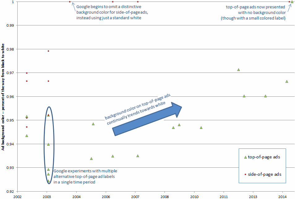
Historically, Google flagged all advertisements by presenting them against a pastel background. The distinctive background helped distinguish both top-of-page and side-of-page advertisements (which had colors) from algorithmic results (which did not).
Over time, these background colors have been dramatically reduced. By 2004, Google eliminated background colors for side-of-page ads. Then, in winter-spring 2014, Google also eliminated background colors for top-of-page advertisements.
The table at right shows Google's advertisement background colors as they stood in the specified periods (with multiple panels showing colors in years that had multiple variants). Each cell of the table reports that color's distance along the spectrum from black to white in RGB color space. Notice the trend towards paler labels, closer to white, denoted by numbers growing closer to 1.000. The subsequent chart presents the same pattern in graphical form.
In winter-spring 2014, Google substituted a small label "Ad" presented adjacent to each advertisement. The label appears with a yellow background, but the ads themselves have no background color. Notably, even this "Ad" label has shrunk over time: When first observed by a few users in November 2013, the labels measured 15 pixels tall by 40 pixels wide. By summer 2014, the label had shrunk to just 22 pixels in width, a reduction of 45%.
The Impact of Less Prominent Advertising Labels
The elimination of distinctive advertisement background colors makes it significantly easier to confuse advertisements with algorithmic results. Examining the change, Moz.com remarked that without a background color, "the ads look more like organic results."
Separately, Moz praised the yellow "Ad" label that now accompanies advertisements. But that label measures just 22x15 pixels -- yielding 330 pixels of distinctive color, whereas historic backgrounds regularly measured thousands or even tens of thousands of square pixels.
Google widely touts the importance of A/B testing to measure the effect of a change to site design. But consider impact of A/B testing on disclosures that reduce advertisement clicks. If a change makes the disclosures smaller or less prominent, it will tend to increase advertisement clicks -- which A/B testing would count as an improvement. In contrast, longstanding legal obligations that the disclosures must be provided and, indeed, must be "clear and conspicuous" -- even if, as appears likely, such disclosures reduce advertisement clicks.
In an August 2014 article, Groupon Director of Product Management Gene McKenna assessed the impact of Google's changing presentation format on paid advertising clicks. McKenna reports that, under Google's prior format (including a distinctive background color for top-of-page ads), Groupon received approximately 15% more clicks on algorithmic results than on paid results. But after Google removed the background color on top-of-page advertisements, paid clicks jumped sharply -- at one point 75% more paid clicks than algorithmic clicks, roughly double the paid clicks Groupon received previously.
McKenna points out that paid advertisements tend to be less relevant than algorithmic results. (My research is in accord. For example, in the third chapter of my Ph.D. dissertation, I found that paid advertisements were nearly twice as likely to fail SiteAdvisor's safety metrics (testing for adware, viruses, spam, and links to other unsafe sites, among other problems) as were algorithmic results for the same search terms.) By diverting users from high-quality algorithmic results to lower-quality advertisements, Google sends users to less useful destinations.
An equally troubling outcome is that Google's advertisements send users to the same sites they were already trying to reach. For example, if a user searches for Groupon, McKenna's research indicates the user is now more likely to click a paid ad to Groupon, whereas in the past the user would often click a no-cost algorithmic link. That's a transfer of wealth from advertisers to Google. Given Google's $60+ billion of cash, it's hard to see how this makes the world a better place.
McKenna finds that the effect of Google's format change ultimately wears off: Three months after implementation, most users had nearly reverted to their prior behavior of skipping over Google's prominent top-of-page ads. But the effect remains notable and, to my eye, worrisome. For one, consider the users too busy or naive to notice -- users who, to this day, will succumb to less relevant advertising and will continue to drive up advertisers' costs. Furthermore, the three-month period is harmful in its own right. Google changes page format often. If every change yields a several-month period where users are confused and advertisers' expenses increase, that's a large fraction of the time when outcomes are needlessly poor. Rather than celebrate the ultimate diminution of the problem, we should bemoan three months of bad outcomes as three months too long.
FTC Guidance and Legal Duties
In 2013, the FTC updated its guide to search engine advertising, offering a new letter to search engines reaffirming the duty to "clearly and prominently distinguish[] advertising from natural search results." The FTC noted the importance of "visual cues" to separate advertisements from algorithmic results:
We recommend that in distinguishing any top ads or other advertising results integrated into the natural search results, search engines should use: (1) more prominent shading that has a clear outline; (2) a prominent border that distinctly sets off advertising from the natural search results; or (3) both prominent shading and a border.
In the next sentence, the FTC indicated that visual cues are to be combined with textual labels, and the inclusion of text labels does not eliminate the need for a distinctive color in order to avoid predictable consumer confusion. Specifically, when the FTC turned to text labels, the FTC noted that "In addition to the visual cues a search engine may use to distinguish advertising, it also should have a text label ..." (emphasis added). The FTC nowhere suggested that one alone would suffice, and the FTC certainly did not encourage Google to abandon its longstanding use of background colors.
In fact , the FTC and others have specifically flagged the problem of pale advertisement colors. The FTC noted that "increasingly, search engines have introduced background shading that is significantly less visible ... that consumers may not be able to detect on many computers or mobile devices." This finding echoed 2012 concerns from search engine guru Danny Sullivan: "Depending on the monitor you use, the color used to highlight and separate ads from editorial content might be hard to discern." Far from acting on these suggestions of distinctive background colors, Google went in the opposite direction -- all the way to white. Taking the FTC's 2013 guidance seriously, Google should return to brighter and bolder colors to separate advertisements from content.
Ultimately, search engines are obliged to assure that advertisements are adequately distinguished from editorial content. My 2010 testing of alternative advertisement labels showed that this is well within a search engine's control; the label "Paid Advertisement" was amply clear, appropriately conspicuous, and no longer than the "Sponsored Links" label that Google had used for nearly a decade. Meanwhile, 2014 research from Bunnyfoot (a British firm specializing in user interface consulting) indicates that 36% of people still do not recognize Google's advertisements as such. There's ample work to be done -- but by all indications Google is headed in the wrong direction.
Postscript: Assessing Google's response
I understand from Charles Arthur at the Guardian that Google interprets the FTC's 2013 letter to allow a search engine to choose either visual cues or text labels to distinguish advertisements from algorithmic results. This interpretation strains the FTC's remarks and is inconsistent with a fair reading of the FTC's 2013 guidance when read as a whole.
The FTC confirms that a search engine's ultimate obligation is to "clearly and prominently distinguish[]" advertisements. The FTC affirms: "Any method may be used, so long as it is noticeable and understandable to consumers." But longstanding and new research (including the materials discussed above) shows that historic disclosures have been ineffective. The appropriate response is to add more disclosure elements, not to remove existing and longstanding disclosures. Groupon's test results, finding a large jump in advertisement clicks when Google removed background colors to make ads look more like organic results, yield the same conclusion -- that many users found Google's revised approach to disclosure insufficiently clear.
Meanwhile, nothing in the FTC's letter affirmatively states that either visual cues or text labels would suffice on their own. To the contrary, multiple sections in the letter anticipate that both would continue. Above, I quote "in addition ... also" wording which indicates that the FTC envisions use of both. Earlier in the letter, the FTC praises “most search engines” for “giving advertising results a different background color or ‘shading’ combined with a text label” as well as noting "factors to ensure that any labels and visual cues used are sufficiently noticeable and understandable to consumers." These phrases endorse and favor the use of both methods, and they nowhere suggest that one method alone is sufficient or desirable.
Notes on data and sources
All colors were extracted from digital screenshots of Google results in the corresponding periods, preserved either by me or by authoritative online sources (Advia and various Search Engine Land articles, among others).
Most of the screenshots were posted to the web, potentially including file resizing and compression. In tests, I confirmed that resizing and compression have minimal effect on color integrity.
To calculate a color's position on the spectrum from black to white, I compute its distance from the origin, D, in three-dimensional color space. I make this computation using the formula at right, where r, g, and b are the component values of the color (expressed as numbers between 0 and 255).
Google often tests new result formats prior to full implementation, and rollout need not be instantaneous for all users. It therefore can be difficult to specify an exact date for a given change. It is also possible -- indeed, likely -- that Google used some background colors I did not find in examining historic screenshots. Nonetheless, I am confident that the data above captures the broad trends in Google advertisement background colors, and that each listed color was indeed among those used in the specified periods.